 Post by
  August 23, 2023 |
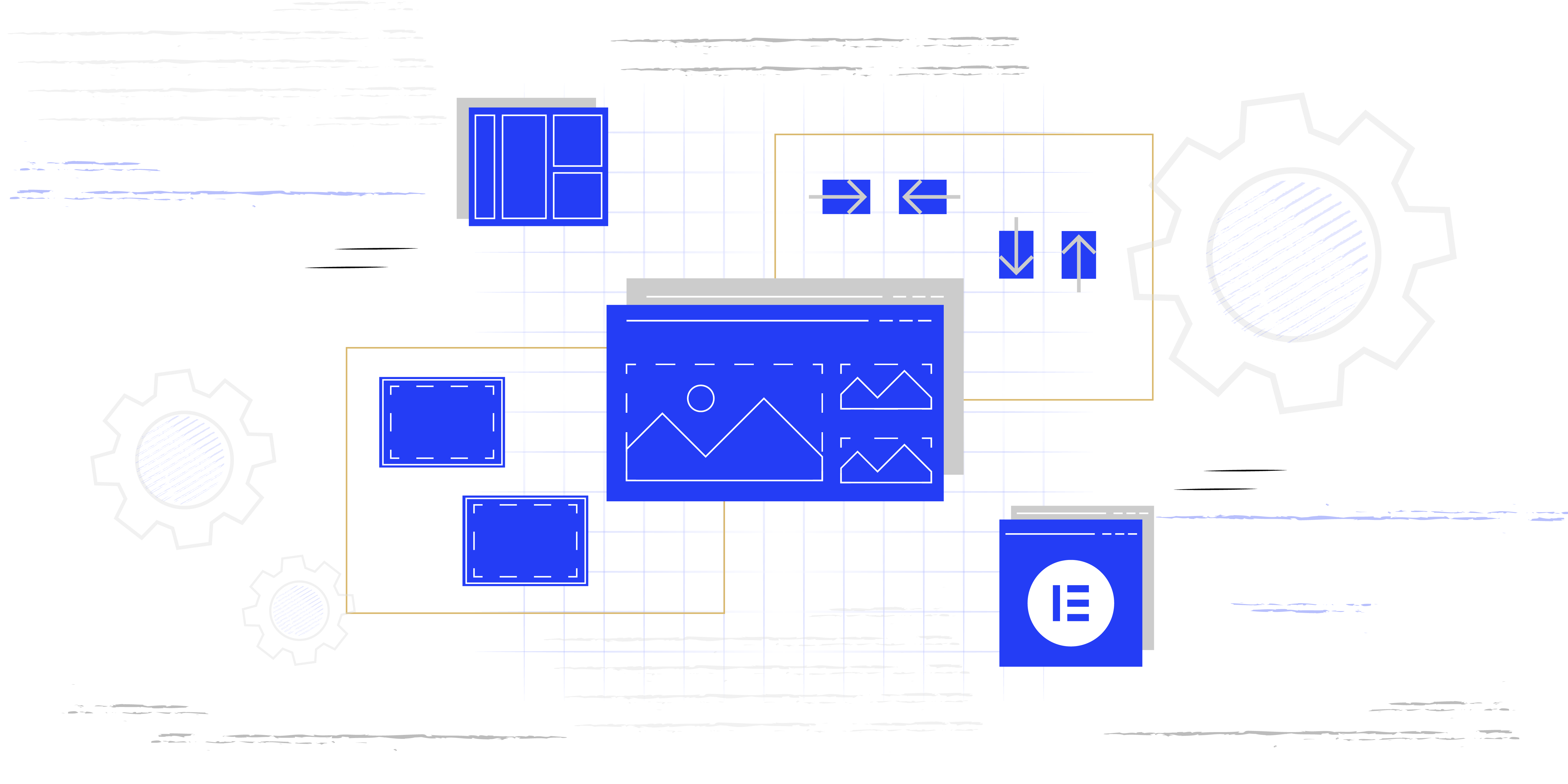
Flexbox containers offer a rapid and effective method for constructing web pages. Elementor Grid Containers represent a particular kind of container. In essence, it functions as a container that holds numerous cells arranged in both rows and columns.

When establishing a Grid Container, you have the ability to specify the desired quantity of rows and columns. Eliminating the need for individually placing containers.
Elementor is using standard CSS grid layout module. It is highly proficient at partitioning a webpage into primary sections or establishing connections, involving size, placement, and layering, among components of a control constructed using HTML basics.
How to add Elementor Grid Containers to the page?
#1: In order to add the Grid Containers to the page, you need to click on the plus sign once you start creating the page with Elementor.

#2: After you click on the plus sign you will see two options, the first one is to add a Flexbox Container and the second one is to add the Grid Container.

#3: Then we need to select a structure from the few predefined options. No worries, you can always change the structure even if you choose a predefined one.
With the structure, you can control how the structure of your content will be. Where the content will be positioned and what is the width and height of the content.

#4: Once you add the Elementor Grid Container widget on the left side (Widget Panel), you will have the option to style the mentioned widget.

#5: Adjusting the Columns value you can choose how many columns you can have in one row.
In each column, you can add any kind of widget. So in this case we have three columns in which you can place three image widgets for example.

#6: The same goes for the Rows. Adjusting the rows value you can choose how many rows of columns you can have on the page.
In this case, we have two rows with three columns. It is that easy.

As shown above, you can create a desired layout with ease using the Elementor Grid Containers.
How to activate Grid Containers?
The Grid Container is currently in the experimental phase. To utilize the Grid Container, it’s essential to have both the Grid Container and Flexbox Container experiments activated concurrently.
In order to activate both Grid Container and Flexbox Container, you need to go to the website Dashboard > Elementor > Settings > Features and then activate the experiments.

After you activate this feature, it will replace the traditional Section/Column layout. So, instead of dragging the Section widget to the page, you will add the Grid Container.
Using the containers, you can create whatever design/layout you imagine since this allows you to nest containers inside containers.
IMPORTANT: Deactivating the Flexbox Container and Grid Container feature will erase all the content you added using the mentioned features. However, by activating it back, you will restore the erased content.
Conclusion
Grid containers simplify the process of crafting balanced designs without the necessity of employing numerous containers or managing multiple design configurations. Grids serve as a valuable asset for maintaining the alignment of elements.