 Post by
  August 3, 2023 |
Elementor Flexbox Containers – One of the new features offered by Elementor. Flexbox (short for Flexible Box Model) is a CSS layout model that provides a more efficient way to arrange and distribute items within a container—making it easier to create flexible and responsive layouts.
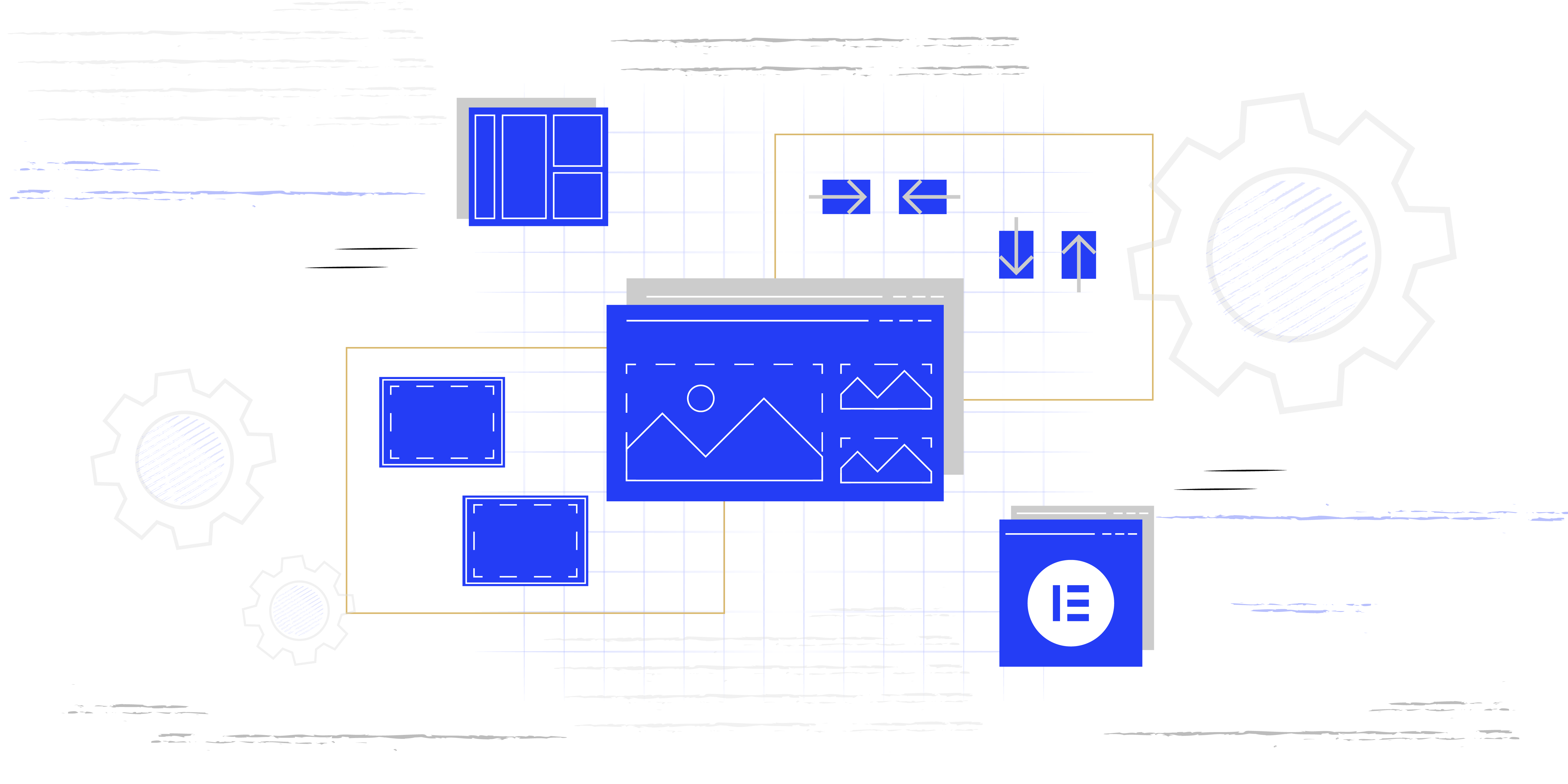
In the context of Elementor, a Flexbox container is a widget that enables users to create flexible layouts by leveraging the power of the Flexbox CSS properties. So, with the Flexbox container, you can control the alignment, distribution, and ordering of its child elements (widgets) to achieve different design arrangements.
The Flexbox container in Elementor allows you to define how items inside it should behave in terms of their size, order, and spacing. You can set the container to be a row or column, and then arrange the child elements within it accordingly.
Know that the Flexbox container replaces the Elementor’s traditional Section/Columns layout.

Key properties of the Elementor Flexbox Containers may include:
- Flex Direction: Determines whether the items inside the container should be arranged. Horizontally (in a row) or vertically (in a column).
- Justify Content: Controls how the items are distributed along the main axis. Horizontally for rows or vertically for columns inside the container.
- Align Items: Specifies how the items should be aligned along the cross-axis (opposite to the main axis) inside the container.
- Flex Wrap: Defines whether the items should wrap onto multiple lines or not when there is insufficient space within the container.

How to activate Flexbox Containers?
In order to activate the new feature Flexbox Container, navigate to Dashboard > Elementor > Settings > Features > Flexbox Container.

After you activate this feature, it will replace the traditional Section/Column layout. So, instead of dragging the Section widget to the page, you will drag Container.
Using the containers, you can create whatever design/layout you imagine since this allows you to nest containers inside containers.
IMPORTANT: Deactivating the Flexbox Container feature will erase all the content you added using the mentioned feature. However, by activating it back, you will restore the erased content.
Conclusion
Using the Elementor Flexbox Container, you can create advanced layouts and achieve more responsive designs for your WordPress website. So you won’t need to deal with complex CSS code directly.